

Home
Studies
& Data Analysis
Methods
Microscope studies
Flagella experiment
Laboratory math
Blood fractionation
Gel electrophoresis
Protein gel analysis
Mitochondria
Concepts/ theory
Keeping a lab notebook
Writing research papers
Dimensions & units
Using figures (graphs)
Examples of graphs
Experimental error
Representing error
Applying statistics
Principles of microscopy
Solutions & dilutions
Protein assays
Spectrophotometry
Fractionation & centrifugation
Radioisotopes and detection
Using Figures - The Basics
Overview
To be useful, the results of a scientific investigation or technical project must be communicated to others in the form of an oral presentation, technical report, journal article or monograph. Effective communication often requires figures, such as photographs, drawings, or graphs, in addition to words and equations. Graphs are the most widely used form of illustration in all disciplines, so this document will present the basic elements of graphical design for science and technology. Examples of good and bad graphs, and specific guidance for creating scientific graphs with Excel, can be found in other documents at this location.
When choosing the type of figure to use, start with the type of data you have collected or intend to collect, and the type of information that you intend to convey. This will help you choose an appropriate tool, perhaps a graph, or perhaps a simple table or a sentence of text. If a graph is appropriate, you then need to make conscious decisions regarding several features in order to maximize its effectiveness. Here is a recommended checklist:
- Decide exactly what type of relationship you want to depict - what would be the purpose of the figure?
- Examine the data, identify the independent and dependent variables and the units
- Select a plot type
- Select an appropriate scale for each axis and plot the data
- Adjust axis proportions to optimize effectiveness of the figure
- Check plot symbols, add a descriptive line and/or error bars if appropriate
- Prepare a legend if necessary
- Write out and place the caption
- If computer graphics are used, check the figure carefully and remove any features that do not belong
Each of these points is discussed in more detail below. If you are preparing a graph for publication you will also need to follow the publisher’s style guide, which typically specifies the allowed size of figures, fonts, labeling, and other typographic details. Those requirements are, however, only a minor adjustment to the general principles provided here.
You might also be interested in our tutorial on using figures (Graphs).
Purpose, Data and Variables
When designing your experiment you had to decide what quantities you would measure and how you would manipulate your experimental system. The quantities you choose to plot, and how you plot them, are an extension of that experimental design, allowing you to analyze and display the relationships inherent in your data.
To be plotted at all, data have to consist of variable quantities. There is no point in plotting something that doesn't vary - a simple statement saves the trouble of preparing a figure. Variables can be classified in two different ways: Independent vs dependent and parametric vs categorical. Different classes are handled differently in a graph.
The independent variable is a quantity or category that is subject to choice or manipulation by the investigator. Examples of independent variables are time, temperature, distance, species, and country. Effective figures almost always use only one independent variable per plot.
A dependent variable is a measured property that varies as the independent variable is changed. A data series or set consists of a group of measurements corresponding to selected values or categories of an independent variable. Effective figures often plot more than one data series on a set of axes.
A parametric variable is one that has a numeric value. It may be continuous, like height and time, or discrete, like a population count. The distinguishing feature is that it has a definite numeric value and can be plotted on a scale.
Categorical variables, like species and country, represent distinct groupings, with no intermediates. It is possible to list categories, but not to assign the category itself a meaningful number that could be plotted.
As an example, suppose that you collected data on the growth rate of several species of plant by measuring plant height at the same time every day. The (faked) results are shown in Table 1. Time is a continuous independent parametric variable which you controlled by deciding at what intervals to make measurements. Height is a continuous parametric dependent variable - the height of each type of plant depended on the number of days it was growing and on the species. The species is an independent categorical variable. Height clearly changed with time and species, so it is reasonable to plot these data in some fashion. Exactly how depends on what you want to demonstrate. If growth rate is of interest, you might plot height vs time for all three species. If only the final height is important you could plot height at day 12 vs species name.
Table 1. Vertical growth of selected plants*
Time |
Acer |
Quercus |
Morus |
0 |
1.0 |
1.5 |
1.0 |
2 |
1.5 |
2.0 |
2.2 |
4 |
2.2 |
2.7 |
3.7 |
6 |
3.2 |
3.2 |
5.4 |
8 |
4.3 |
3.5 |
7.0 |
10 |
5.2 |
3.7 |
8.7 |
12 |
5.6 |
3.8 |
10.3 |
*Height, in cm
To summarize, the purpose of a figure is to facilitate analysis and understanding of variable data, and convey that understanding to a reader. That will determine what you plot and how you plot it.
Anatomy of a graph
There are many different types of plots, not all of which are used in technical presentations. The most common employs a symbol to plot each data value on an x-y coordinate plane. This is called a scatter plot, x-y plot, or line plot. Bar charts are also commonly used, particularly for histograms and when the independent variable is categorical. Examples of these types will be given below. Computer graphing packages also offer variants, such as “3D” bar charts and pie charts, but they are almost never used in a scientific context.
The elements of a typical graph are shown in figure 1. The vertical (y) axis (the ordinate) always represents the dependent variable(s), while the horizontal (x) axis (the abscissa) always represents the independent variable. We describe the dependent variable(s) as plotted versus the independent variable. There are scale markings on the axes, either numbers for parametric variables or names for categorical variables. Both axes must have an axis label with the name of the variable and units, if applicable. The axes define the plot area, which is usually not enclosed on the other sides. A caption below the axis describes the content and, for a formal publication, identifies the figure by number.
The data are represented with plot symbols or, sometimes, plotbars to make a bar graph. Plot symbols are sometimes identified with a legend in the plot area or, more commonly for technical work, in the caption.
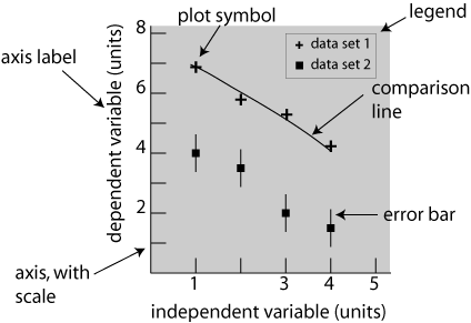
Fig. 1 Basic form of a graph. The plot area is indicated by shading, however if this figure was to be published shading would be considered "clutter" and would be removed. A full description and key to variable symbols, etc. would replace this text in the caption.
The various features of typical graphs are illustrated in figures 2 and 3, which show two different ways of plotting the plant growth data listed in table 1. Note that in both plots an independent variable goes on the x-axis, while the dependent variable is on the y-axis. In figure 3 the order of the category names is, of course, not significant and could be permuted without changing the meaning of the graph. This fact is reinforced by the choice of a bar graph, rather than symbols that one might be tempted to connect with a meaningless line.
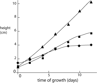
Fig. 2 Typical growth rates of selected plant species. Solid lines are a guide to the eye.
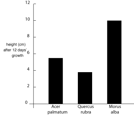
Fig. 3 Cumulative growth patterns for three common North American tree species.
Scales, Axes and Proportions
The axes are the horizontal and vertical lines that define the plot area. Each axis must have an appropriate scale, either numeric or categorical, that defines the value of the plotted points. Proportion refers to the shape of the plot area, which may be square, wider than it is high, or higher than it is wide.
Scales for categorical variables are just a list of names. The names are usually spaced evenly along the axis, in an arbitrary order.
Scales for parametric variables must, of course, be numeric. The scale may be linear, logarithmic, or something more elaborate. If the nature of the scale is not obvious it must be defined in the figure caption or axis label.
Scale values are usually marked at regular intervals, with the exact location indicated by at tic mark, a short line across the axis. It is easier to read the graph if the marked values are simple numbers, such as multiples of 1, 2, or 5.
The upper and lower limits of the scales should be selected so that there is minimal blank space in the plot area. There should be at least one data point near each end of each axis, so that the data encompass the full two dimensional range of the plot area. If there are no data near the origin, it may be preferable to start one or both scales at a non-zero value.
The plot area must be properly proportioned. Much of the time the purpose of the figure is best served if the plot area is square. Depending on the data you are plotting, you might decide that the figure is more clear if it is wider than it is high, or vice versa. Regardless, it is your choice to make.
Symbols, Error bars and Fit lines
Data sets usually consist of pairs of discrete values, and each point should therefore be plotted with a symbol rather than a connect-the-dots line. (An exception might be made if the data are effectively continuous, as from a chart recorder. This is a rare situation, however.) The symbol chosen should be a dot or some other simple form. If multiple data sets are being plotted on the same graph, use different symbols for each set and pick them so that the reader can easily discern the difference.
It may be important to represent experimental error, in which case each data point will include an error bar. The caption should then state whether the error is a standard deviation, outer limit or something else.
Often, when you prepare a graph you should include a comparison line along with the data. In the simplest case, the line may simply guide the reader along the points of a data set to help qualitative understanding. Alternatively, the line may represent a calculation or theory that purports to describe the data. In either case, one does not expect the line to exactly match all the data points because there will inevitably be some uncertainty in the experimental values. The nature of the line, guide or theory, must be specified in the caption.
It is seldom justified to extrapolate experimental data. Unless an application specifically requires extrapolation, we generally confine curve fits to the actual data range. Computer graphing routines are particularly prone to extrapolation, often producing blatant nonsense.
Color can be a useful identifier on graphs intended for internal use or for presentations at meetings. It is an easy way to distinguish among data sets or fit lines, and is often used to make a presentation more dramatic and effective. Nevertheless the symbols and/or comparison lines should be distinguishable by factors other than color alone since some viewers may be color-blind. Color is used only rarely for graphs in professional journals, since publishers charge extra fees for color figures if they will print them at all.
Labels, Legends and Captions
Both axes of a graph require labels. For a categorical scale, the names of the categories will usually suffice. The label for a numeric scale must identify the variable being plotted and the units of that variable.
A legend in the form of a text box in the plot area is sometimes used to identify the symbols associated with each data set. If present, the legend must be placed in the plot area so that it does not detract from the display of data. In formal technical publications legend information is often placed in the caption, but a legend may be useful for other presentations such as posters or talks.
Every figure has a caption placed beneath it that describes the content in a few lines. The caption usually starts with a sequential figure number that is used for reference elsewhere in the paper. There should then be a statement of what is being plotted, identification of the symbols used, and the nature of any comparison lines in the graph. Concentrate on making the caption informative. Ideally, the reader can get an accurate grasp of the content of a paper by looking only at the figures and their captions.
Computer Graphics
Computer programs can be powerful tools for producing technical graphs, but they must be handled with care. The default choices often reflect the preferences of business users and the popular press, and are poorly suited to the precise presentation of data. Some specific points to watch for and avoid:
- Background shading and “3D” shading effects are a distraction and may cause perceptual distortions.
- A legend is often created, even when there is only one data set. Suppress it unless there is good reason to have one.
- Grid lines are useful if one wants to read numbers off the graph, but should be suppressed for presentations and publications.
- Some programs will try to connect data points with straight lines. We call this method "interpolation." More often than not, interpolation is inappropriate.
- Be sure the scales are correct. Some program defaults will place data points at equal intervals along the x-axis, regardless of the values of the variable.
Microsoft Excel was designed for business applications, thus many of the default features are completely inappropriate for scientific/technical work. You can produce a good figure using Excel, but it takes some extra effort and "know-how." Proper use of Excel for technical graphing is discussed in a companion document.
Visitors: to ensure that your message is not mistaken for SPAM, please include the acronym "Bios211" in the subject line of e-mail communications
Created by David R. Caprette (caprette@rice.edu), Rice University Dates