

Home
Studies
& Data Analysis
Methods
Microscope studies
Flagella experiment
Laboratory math
Blood fractionation
Gel electrophoresis
Protein gel analysis
Mitochondria
Concepts/ theory
Keeping a lab notebook
Writing research papers
Dimensions & units
Using figures (graphs)
Examples of graphs
Experimental error
Representing error
Applying statistics
Principles of microscopy
Solutions & dilutions
Protein assays
Spectrophotometry
Fractionation & centrifugation
Radioisotopes and detection
Error Representation and Curvefitting
As far as the laws of mathematics refer to reality, they are not certain; and as far as they are certain, they do not refer to reality --- Albert Einstein (1879 - 1955)
This article is a follow-up to the article titled "Error analysis and significant figures," which introduces important terms and concepts. The present article covers the rationale behind the reporting of random (experimental) error, how to represent random error in text, tables, and in figures, and considerations for fitting curves to experimental data.
You might also be interested in our tutorial on using figures (Graphs).
When to report random error
Random error, known also as experimental error, contributes uncertainty to any experiment or observation that involves measurements. One must take such error into account when making critical decisions. When you present data that are based on uncertain quantities, people who see your results should have the opportunity to take random error into account when deciding whether or not to agree with your conclusions. Without an estimate of error, the implication is that the data are perfect. Random error plays such an important role in decision making, it is necessary to represent such error appropriately in text, tables, and in figures.
When we study well defined relationships such as those of Newtonian mechanics, we may not require replicate sampling. We simply select enough intervals at which to collect data so that we are confident in the relationship. Connecting the data points is then sufficient, although it may be desirable to use error bars to represent the accuracy of the measurements. When random error is unpredictable enough and/or large enough in magnitude to obscure the relationship, then it may be appropriate to carry out replicate sampling and represent error in the figure.
Representing experimental error
The definitions of mean, standard deviation, and standard deviation of the mean were made in the previous article. You may also encounter the terms standard error or standard error of the mean, both of which usually denote the standard deviation of the mean. The first set of terms are unequivocal, and their use is preferred. However, in the biological sciences one most often encounters the term standard error of the mean (SEM) rather than standard deviation of the mean.
Assumptions
The methods described here assume that you have an unbiased sample that is subject to random deviations. Furthermore, it is assumed that the deviations yield a valid sample mean with individual data points scattered above and below the mean in a distribution that is symmetrical, at least theoretically. We call such a distribution the normal distribution, but you may know it better as a "bell curve." Most of us assume that we have a normal distribution, and sometimes that assumption is not correct.
Some data distributions are skewed (i.e., shifted to the right or left) or multi-modal (i.e., with more than one peak). For example, the height distribution of a sample of an African population might have two peaks - ethnic Bantu and ethnic Pygmies. We have methods of analysis to cover just about any type of data distribution, but they are beyond the scope of this article.
What measure of error should I use?
In the sciences, the mean is the most commonly used expression for a central tendency, particularly for hypothesis testing. When we report a mean we usually use either the standard deviation or standard deviation of the mean as our measure of error. Some uses for raw data call for expressing a mode (the most repetitive value in a data set) or a median (the number in the middle of a data set). Sometimes it is best to provide a range. For example, an investor might be interested in the high and low values of a particular stock over a given time period. The mean value would have no relevance in that case.
A central theme in all of these articles is the need to establish a context for what you are doing in order to make the appropriate critical decisions. Are you interested primarily in how widely the data points were scattered about a mean value? Usually, when reporting a single set of data or simply showing the data for several different categories, one represents error using the standard deviation. The idea is to demonstrate the extent to which random error influenced the reliability of the data.
Are you more interested in the range of values that the true mean is likely to occupy? You would probably choose to report mean plus/minus the standard deviation of the mean. For example, when comparing means with respect to some independent variable one is usually interested in the likelihood of differences between or among mean values, or the manner in which the dependent variable changes with changes in value of the independent variable. The standard deviation of the mean is generally more relevant when plotting a data series to be compared with another data series or to some theoretical model.
Sometimes you don't take replicate samples, but nevertheless your data are subject to inaccuracy simply because no measurements can be perfectly accurate. Say, for example, you measure the mass of an object by weighing it with a digital balance. Provided the instrument is calibrated to sufficient places, your estimate should be accurate out to the second last digit. You would report some measure of accuracy, such as "all measurements are accurate to ± 0.1 grams."
With experience you may be able to decide for yourself whether it is more appropriate to show the range over which individual data points were scattered (standard deviation), the range representing the probable value of the true mean (standard deviation of the mean), some other means of representation, or to omit the representation of error entirely. As a general rule, it is best to look at examples from the literature in your field in order to make decisions regarding what type of analysis to use and how to represent error.
Reporting data in text or tables
Assuming that you have a normal distribution, a set of data for a single
sample can be written in text or in a table as mean ± error, which
is usually either the standard deviation or the standard deviation of
the mean (e.g., 9.8 ± 0.02 m/s2). Note that in the example
meaningful units were used when reporting the values. When you
report data this way most of us will assume that you are reporting the
mean ± standard deviation. However, the safest thing is
to state exactly what you are reporting. Some people may report
the standard deviation of the mean instead of the standard deviation
of the distribution. A journal may stipulate in its guidelines
that means and errors should be represented in text as ![]() ± standard
deviation, however one cannot be sure that the author followed instructions
unless there is some statement to that effect in the paper. Of
course if you report some other type of error, such as a measure of accuracy
of your measurements, you should provide the appropriate information.
± standard
deviation, however one cannot be sure that the author followed instructions
unless there is some statement to that effect in the paper. Of
course if you report some other type of error, such as a measure of accuracy
of your measurements, you should provide the appropriate information.
Representation with error bars
It is standard practice to report error when preparing figures that represent uncertain quantities. To represent random error, we commonly use what we call an error bar, consisting of a vertical line that extends from the mean value in proportion to the magnitude of the error. The most common type of error bar that you will encounter includes a "cap" that clearly indicates the end of the bar in each direction. The ends of the bar correspond to the mean plus or minus the standard error. You may occasionally find error bars that are drawn differently and they may indeed have different meanings. It is best to scrutinize figure legends and to be aware of conventions in one's field when interpreting the meaning of such symbols.
The (faked) data of figures one illustrate the use of error bars in a column graph. Just as with text and tables, it is essential to indicate what type of error is represented, as was done in the captions to figures 1. The standard deviation was chosen for figure 1A because the author intended to show the variability of prices from city to city rather than to compare prices among items. The purpose of figure 1B was to compare prices among the three items, therefore the author chose to use the standard deviation of the mean.
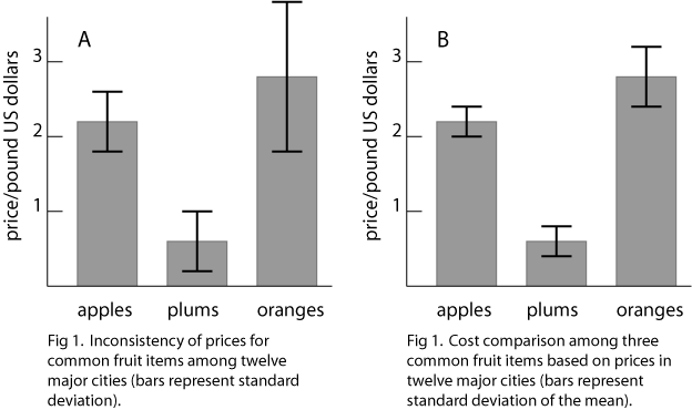
Often it suffices to visually inspect differences between means and their errors in order to draw a conclusion. For example, it is obvious that there is a significant difference in cost between plums and oranges in figure 1B. However, the conclusion is not so obvious when comparing the prices of apples and oranges. For such comparisons the results of a statistical analysis such as "Student's" t test or an analysis of variance might be illustrated in the figure itself or placed in the caption or text. By the way, it is conventional to represent data in the single most effective way that is available, and to report the single most appropriate statistical analysis.
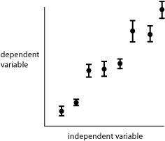
Fig 2. Representation of errors (standard deviation of the mean) about a series of data points.
Figure 2 shows the use of bars to represent errors in the graph of a relationship between two parametric variables. The standard deviation of the mean is depicted in this hypothetical data set, showing the probable range for the true mean that is represented by each data point.
Curve fitting
Figures are often more effective if there is a line (curve fit) that illustrates the relationship depicted by the data. As with everything, there are choices to be made when producing a curve fit. One choice is whether to include a trendline or to perform a true curve fit. A trendline is used simply to guide the reader's eye in order to make a figure easier to interpret. Trendlines are especially useful when multiple data sets are plotted. The lines make it easier to distinguish one data set from another.
When the object is to draw precise quantitative information or to look for subtle deviations of experimental data from theoretical relationships, a trendline may not be sufficient. In addition, random error can make the position of a trendline very uncertain, and then it may be necessary to perform a mathematical curve fit.
Trendlines
When one sketches a line that connects individual data points, or fits a curve to data by visual inspection alone, one has produced a trendline. Trendlines are perfectly acceptable for use in illustrating a relationship, such as when presenting data in a talk or on a poster or when plotting data for which random error is so small, connecting the data points suffices to show the relationship. Often, the theoretical relationship is obscure or so complex that a true curve fit would be difficult or nearly impossible to perform. In such cases, or when a curve fit is simply not necessary, error bars can help in determining how to sketch a trendline.
Figure 3 is an example of a trendline that was placed by visual inspection of the data of figure 2. The hypothetical nature of the data called for the relationship to begin at the origin (0,0). It was then only necessary to adjust the slope of the line.
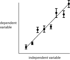
Fig. 3. Use of a trendline to display a relationship between variables.
The trendline in figure 3 was positioned so that the same number of data points fall significantly above the line as below the line. Note that the line does not intersect all of the data points. If the theoretical relationship is linear, then connecting the data points makes no sense. Note also that the line misses three of the error bars as well. That is of no concern, since the probability is about 1/3 that a true mean will differ from the experimental mean by greater than one standard deviation of the mean.
True curvefitting
To fit a curve to a set of data it is necessary to come up with a theoretical model for the relationship, the simplest of which would be a linear relationship. There are simpler relationships, but you would not plot them. It is essential that the investigator be cognizant of the purpose of the data, the reliability of the theoretical model, and the consequences of overlooking deviations of the data from the model. For example, if the data suggest a linear relationship, you fit a straight line to the data, and then apply the relationship to construction of a critical component of the space shuttle, you had better be darn sure that the relationship is truly linear.
Inspection of the data of figure 2 suggested that they represent a linear relationship. Suppose that a theoretical model supports such an expectation. How does one accurately fit a line to the data?
Simple linear regression, also known as the method of least squares, is a common method for determining the equation for the straight line that best represents the relationship between two variables. Regression analysis is typically conducted mathematically with computer assistance, by a method designed to minimize the sum of the squares of the y-deviations.
The principle might be easier to see when described visually. In figure 4 a straight line was drawn among four data points so as to be a close visual fit. Next, a square was constructed for each data point, such that the side of each square was of length equal to the distance of the data point from the line, in the y direction. The box at right represents the sum of the areas of all four squares. To perform the regression, the slope and intercept of the line are adjusted until the sum of the areas of all of the squares reaches its minimum value, that is, the box has the smallest surface area attainable with this data set. At that point, a "line of best fit' has been established.
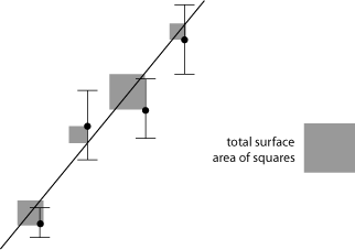
Fig 4. Determination of a best fit line by the method of least squares
Error bars are shown in figure 4 but they were not involved in the analysis. Uncertainties could nevertheless be considered. Much of the time we do not have good error estimates for each data point, so we assume that errors are all the same. When good error estimates are available it may be more accurate to weigh the contributions of individual data points according to their reliability. A couple of methods for doing that are weighted linear least squares and chi squared minimization.
Curve fitting for nonlinear relationships can also be accomplished by the method of least squares and/or by a weighted analysis. It is necessary to have an accurate model, represented by a general equation type (e.g., quadratic, logarithmic, circular function, exponential). Computer programs can be used to select the constants so that the best fit for a particular equation type can be made to the data.
Visitors: to ensure that your message is not mistaken for SPAM, please include the acronym "Bios211" in the subject line of e-mail communications
Created by David R. Caprette (caprette@rice.edu), Rice University Dates