

Home
Studies
& Data Analysis
Methods
Microscope studies
Flagella experiment
Laboratory math
Blood fractionation
Gel electrophoresis
Protein gel analysis
Mitochondria
Concepts/ theory
Keeping a lab notebook
Writing research papers
Dimensions & units
Using figures (graphs)
Examples of graphs
Experimental error
Representing error
Applying statistics
Principles of microscopy
Solutions & dilutions
Protein assays
Spectrophotometry
Fractionation & centrifugation
Radioisotopes and detection
Graphic Examples
This document provides examples of a number of graphs that might be used in understanding or presenting data. Comments with each example are intended to help you understand why the data were plotted in a certain fashion, or why it should have been done differently.
You might also be interested in our tutorial on using figures (Graphs).
To plot or not to plot?
The purpose of plotting scientific data is to visualize variation or show relationships between variables, but not all data sets require a plot. If there are only one or two points, it is easy to examine the numbers directly, and little or nothing is gained by putting them on a graph. Similarly, if there is no variation in the data, it is easy enough to see or state the fact without using a graph of any sort.
When a graph is appropriate, it must be of an appropriate type to avoid misleading the reader.
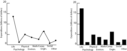
Fig. 1. Research expenditures for various scientific fields.
Both plots in figure 1 show US research expenditures by discipline in 2000. The scatter plot on the left is incorrect because it implies a relationship between the variables on the two axes, further reinforced by the connecting lines. Since the horizontal axis is just a list of disciplines with no inherent ordering, no relationship can exist. Categorical data of this sort are better plotted as a bar graph, as on the right, since such a graph displays the relative magnitudes without implying a functional relationship. (Pie charts are often seen in the popular press for financial data, in order to emphasize the relative size of the allocations. Pie charts are rarely used in technical fields.)
A set of common mistakes
It has been argued that smoking causes lung cancer. One way to test this hypothesis is to look for a relation between tobacco smoking and lung cancer. The figure below plots data for cigarette consumption in 1930 and male death rate from lung cancer in 1950 for several countries.
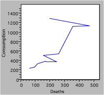
Fig. 2. Deaths due to cigarette consumption.
There are a lot of mistakes in figure 2, including
- Missing units – is it total consumption and deaths, or normalized for population?
- Reversed axes – we suspect that smoking leads to cancer, not the converse. The independent or causal variable goes on the x-axis.
- The jagged line connecting the points has no basis. The scatter of the data suggests large random effects, not real changes from point to point.
- A caption that is not particularly helpful.
Redrawing the graph produces the following result
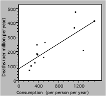
Fig. 3. Death rate from lung cancer vs cigarette consumption for several countries. The solid line is a linear fit to the data.
The straight line represents a simple model, which may be the best that these badly-scattered data can support. The extrapolation to zero consumption may or may not be valid, and would have to be tested with other data.
Misleading scales
An experiment is conducted to determine how much a solute contributes to the volume of the resulting solution. The procedure is to add weighed amounts of a salt, KCl, to 100 ml samples of water. After allowing the system to come to equilibrium the solution is filtered to remove any residual solid and the volume of solution is measured.
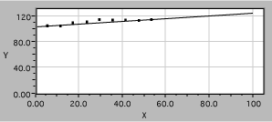
Fig. 4. Solution volume as a function of KCl mass.
The data are plotted in the figure above, in a manner which is worse than useless. Note the following problems:
- Axes are not labeled with the quantity measured, nor are units identified.
- The axes are very unequal in length, for no visible reason.
- The vertical scale has too wide a range to display the range of the data.
- The horizontal scale is also too long, extending well beyond the data range.
- Grid lines add clutter but not information.
- A fitted straight line is shown, but the scales make it hard to tell if it is accurate.
- The fit extends far beyond the data, without justification.
Fixing these errors produces the plot in figure 5. It is now clear that the solution volume increases with added solute mass, but only until the solution becomes saturated, so a linear fit to the whole data set is just nonsense. Below saturation, the scales now allow the reader to evaluate the data accurately, for example to see if the volume increase is linear below saturation or if more data are required to decide.
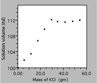
Fig. 5. Solution volume as a function of KCl mass.
Computer fits
Experimenters often use computer-generated best-fit lines to demonstrate agreement with some model or theory. For example, a student has data from a radiation experiment which consisted of observing the number of gamma rays emitted in a fixed time interval. Counts were obtained for many time intervals and the results plotted as a histogram. The next step is to see if the distribution of counts follows the expected Gaussian distribution. Using the defaults in a poor fitting program might produce this result.
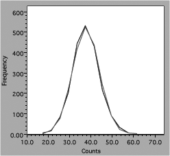
Fig. 6. Comparison of data and theory for counting experiment.
One line consists of data, the other theory, but it is hard to follow either one (impossible with a monochrome version). Connecting the data dots is also incorrect because it implies that there are more data than actually present. A better presentation would look like figure 7.
The actual data points are now clearly distinguishable symbols, showing that the raw data for four count values has been binned together and that there is some scatter around the theory curve. The theory itself is displayed as a smooth solid line because the values can be calculated everywhere and there are no uncertainties in the calculated numbers. Any program to be used for scientific graphing must be able to produce a similar plot.
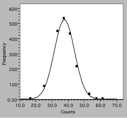
Fig. 7. Histogram of interval counting data. The solid line is the expected Gaussian distribution, squares are observations.
Guiding experimentation
Data plots are often a useful guide to experimentation. A plot will quickly show if parameters are varying as expected, and may indicate regimes where more or less data are needed.
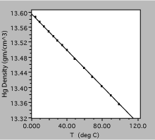
Fig. 8. Density of liquid mercury as a function of temperature. The solid line is a linear fit to the observations.
The plot in figure 8 was obtained by measuring the density of liquid mercury as a function of temperature. Over the range shown, the density decreases linearly with temperature, to a very good approximation, and one could define a volume expansion coefficient from the slope of the line.
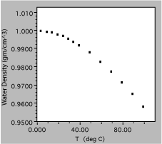
Fig. 9. Density of liquid water as a function of temperature.
The next liquid measured was water, which is clearly a much more complex substance. The total variation from 0 to 100 C is only about 5%, showing the need for good precision of measurement, and is certainly not linear. In fact, it might be useful to get more data in the region around 0 C, to find out if the density approaches zero uniformly or has a maximum in the region.
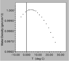
Fig. 10. Density of liquid water as a function of temperature, expanded scale.
The results of the additional measurements are plotted above, clearly showing a peak in the density as a function of temperature. Note that these data are plotted on even more expanded scales, with a vertical range of only 0.4%. Since this is needed to show the small maximum, both plots would probably be included in a report of this experiment.
Transformation of variables
It is sometimes helpful to mathematically transform one or both of the variables before plotting. The technique can be used to linearize data to simplify model fitting, or to change the way data are distributed to clarify display. The exact procedure will depend on the situation, but two examples will show the process.
Making a relationship linear
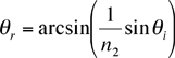
A beam of light is bent when it is incident on a plane surface between different substances. The angle of refraction is related to the angle of incidence by Snell’s law,
![]()
A student measures the incident and refracted angles for an air to glass interface, and wants to find the index of refraction for the glass, n2, knowing that the index for air n1 = 1.000. Believing that a graph would be a good way to analyze the data, the student solves for the refracted angle in terms of the incident angle
A computer program might fit this function, but the available program won’t do the arcsin function, so the student tries to be more clever. Noting that
![]()
she plots sinqr vs sinqi, with the following result
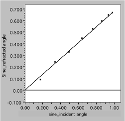
Fig. 11. Linearized refraction data. The solid line is a fit, assuming Snell’s law.
It is now easy to see that the data are well described by the expected straight line and to obtain the slope, which is 1/n2.
Changing the distribution
Next, consider the graph below, which plots the number of state employees vs the total population for the 50 US states in the year 2000. Evidently, there are a lot more small states than large ones, so the data are bunched near the origin. The straight line is drawn on the assumption that the size of the bureaucracy is simply proportional to the number of citizens. Unfortunately, this assumption does not appear to be valid, since there seem to be systematic deviations at the low end, where the data are hard to distinguish, and the intercept is not zero. Another approach is needed.
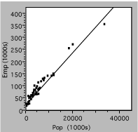
Fig. 2. Number of state government employees vs total state population in 2000.
The next plot uses the same data, but they aredisplayed as the logarithm of both employee and population numbers. The effect of taking a log is to spread out the small values and compress the larger ones, causing the data to be more uniformly distributed on the axes. This often aids visualization of deviations or other problems.
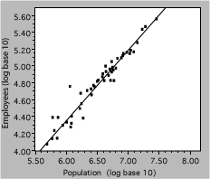
Fig. 13. Number of state government employees vs total state population in 2000. The line represents a power-law fit to the data.
Log-log plots are also useful for demonstrating power-law or scaling relations. A power law,
y = axb
in which the exponent b is not necessarily one, is a generalization of the familiar proportionality. Taking the logarithm of both sides, we get
log y = blogx + loga
so a power-law relationship is a straight line on a logy vs logx plot, with slope of b. Referring back to the bureaucracy example, the slope of the line shown is 0.79, indicating that the number of state employees increases somewhat less rapidly than the population. An economist would note that this is an example of ‘economy of scale’.
Visitors: to ensure that your message is not mistaken for SPAM, please include the acronym "Bios211" in the subject line of e-mail communications
Created by David R. Caprette (caprette@rice.edu), Rice University Dates