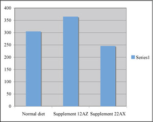
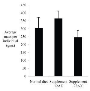
At left is an original draft and at right is a decent version, ready for a caption and publication. How did your graph compare?
|
|
Of course, we eliminated the "chart junk, labeled the axes, and made it all black and white. You might notice that Excel also adds a shadow effect to the columns by default. It does the same thing with data symbols. We really don't need a shadow effect for a published figure, although it may enhance an oral presentation.
How do your error bars compare to the ones in the second figure? The bars represent standard deviations rather than standard deviations of the mean. Standard deviations were chosen rather than standard errors of the means because we are interested in variation among individual animals. That is, how consistent were the results from one individual to the next? We don't do trend lines when the independent variable is categorical, so there is no need for an estimate of the range of variation among sample means.
Suppose that you have developed a new assay for determining protein concentration in a sample. Your assay takes just five minutes for color to develop and the sensitive range runs from 5 micrograms to 1 milligram of protein. You conducted the assay five times to check for reproducibility, quantifying the color change by measuring optical density at wavelength 650 nm.
Beer's Law predicts that optical density (O.D.,which is a unitless quantity) will be directly proportional to the concentration of a solute that absorbs light at the selected wavelength. All of the sample volumes were kept the same, thus the O.D. is predicted to be proportional to amount of protein in a sample tube.
The sensitivity range is so wide that you need to prepare two standard curves to show the relationship between O.D. and amount of protein. Putting all the data on one set of axes would squeeze the smallest values near the origin. Here are data from the five trials for a range of protein amounts from 5 to 100 µg.
| Amount protein (µg) | 5 | 10 | 20 | 40 | 60 | 80 | 100 |
| Optical Density (650 nm) | 0.006 | 0.009 | 0.018 | 0.070 | 0.083 | 0.10 | 0.11 |
| 0.008 | 0.010 | 0.024 | 0.050 | 0.092 | 0.078 | 0.14 | |
| 0.006 | 0.014 | 0.032 | 0.053 | 0.086 | 0.12 | 0.10 | |
| 0.006 | 0.008 | 0.027 | 0.052 | 0.055 | 0.091 | 0.16 | |
| 0.006 | 0.010 | 0.024 | 0.056 | 0.10 | 0.14 | 0.12 |
Notice that all values were recorded to a maximum of two significant figures. Now conduct the necessary calculations, arrange and plot the data. Fix up your graph so that all it needs is a caption to be ready for publication.