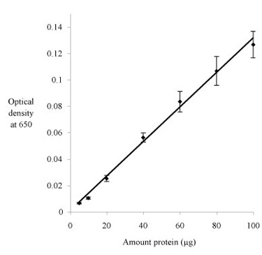
How did your graph compare with the plot pictured below?
This time the trend line is an actual curve fit – a straight line produced using linear regression. A curve fit works this time because the variables are proportional in theory and because the data are consistent with theory. The slight curvature in the distribution of data can be attributed to random error, as the curve fit is well within the error bars (s.e.m.). If you plot O.D. versus amounts of protein up to or beyond 1 mg, then you probably will see curvature. The color reagent becomes saturated at high concentrations of protein, so that O.D. doesn't change as much for a given increase in amount protein, and eventually it doesn't change at all.