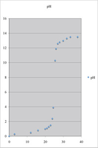
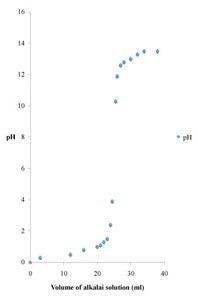
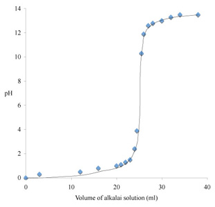
Upper left is the original draft, upper right is a cleaned-up version, and at bottom is a completed graph ready to be incorporated into text as a figure. How did your graph compare?
|
|
|
|
||
We don't need grid lines, the title pH at the top, or a legend insert. I used Chart Options... to get rid of them. Note, though, that if you were to use this plot at a tool for extracting numbers, you would want to put grid lines in here. Some disciplines might even call for grid lines routinely, but they are not commonly used in biological sciences.
I also used Chart Options... to label the x and y axes. I had to select the y axis label "pH," and use Format/Selected Axis Title... to re-align it. You can orient a y axis label vertically, but with the short label "pH," a vertical alignment doesn't make much sense. I double clicked on the plot area to get rid of the gray shading and on the outer border to eliminate the border line (but the white fill is convenient, so I kept it). The graph (middle) looks pretty decent already.
We needed a few more things after that, namely to proportion the plot area, to fix the font, to make the data symbols just a bit bigger, and to put in a trend line. It took a few tries to get the trend line to work, using the curve tool in the drawing toolbar (bottom figure).
The curve fit isn't perfect, of course. I drew one in using the curved line tool (S shaped icon in the "lines" part of the drawing toolbar). It takes a few tries to get it close. A mathematical curve fit is possible, but to obtain all of the parameters requires a detailed analysis, even for a titration curve with only one inflection point.
Recall the experiment in which three groups of animals were fed different diets for a month. Animals were sorted so that the mean mass per animal at the start of the experiment was nearly the same for each group. A good experimenter will also ensure that the distribution of masses was the same in each group. At the end of the experiment mean masses per animal for groups 1-3 were 305 ± 65, 365 ± 46, and 246 ± 43 grams, respectively. The errors are standard deviations.
Here is some more information for you. Group 1 animals received a normal diet. Groups 2 and 3 received "supplement 12AZ" and "supplement 22AX," respectively. There were 11 animals in each group.
Use your graphics program to plot these data. Generate a first draft using the computer defaults and then clean up the graph to make it suitable for a figure. Keep a copy of the initial plot for the before/after comparison on the next page.