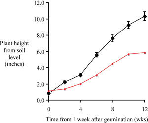
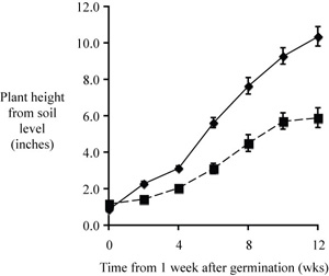
At left is the new plot, just as it showed up after adding the second data set. At right is the same plot, with important changes.
|
|
We seldom use color in figures prepared for a manuscript, so let's select the trend line and change the color to black. Your second set of data symbols should be the same point size as the first set, and you will need to put in the error bars. You might also want to make the second trend line a bit different, maybe a dashed line. You should be prepared now to generate the second plot, above.
Now can you write a suitable caption for the complete figure? You might just modify the previous caption.
Time is the independent variable, to be plotted on the x axis; height (a measured quantity) is a dependent variable, to be plotted on the y axis.
A good choice for plotting these data is to use a scatter plot (XY scatter) of mean values verus time, rather than a scatter plot of raw data; other plot types are not suitable for this kind of data set.
"Computer clutter" should be replaced by X and Y axis labels, a figure caption, and perhaps an appropriate trend line.
A good caption includes just enough information to permit it to stand apart from text.
We typially include an error estimate when reporting mean values
– standard deviations for means reported in text or a table and
error bars representing the s.e.m.s for mean valuess in a scatter
plot.
If you intend to compare two sets of data they should be plotted on axes with the same scale and proportion; if practical they should be plotted in the same figure.