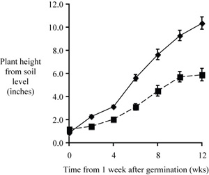
Here is a completed figure that would serve in a manuscript to compare growth rate between the two tree species.
|
| Fig. 1. Mean growth rates of Morus alba and Acer palmatum seedlings (n = 12 per sample). Measurements began one week following germination. Height was measured as the distance from soil level to base of the top leaf of the seedling. Error bars represent standard error of the mean. |
Here is one last suggestion before we move on. The mean values that we plot are only sample means, not true mean values. Interpolation produces a reasonably accurate trend line when errors are small. When the data are more scattered a line that runs among the mean values without necessarily intersecting most or all of them better represents the relationship. The following plot of length versus time, from an unidentified study, demonstrates the point.
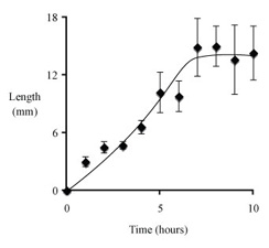
Unfortunately, graphing programs do not make it easy to fit trend lines this way. Curve fits don't work when there are different phases to a relationship between variables. In this case there was close to linear elongation followed by a leveling off. A single relatively simple equation cannot produce an accurate curve fit. Excel has a selection in its drawing toolbar for making curves (S shaped icon under "lines"). The curved line tool is tricky to use, but after a few tries you should be able to reproduce the curve that you want.
Suppose that your paper came back from the review process and the referees commented that early growth rates are of no interest, just the terminal heights after 3 months growth. They also suggested including a third species, the red oak Quercus rubra (don't ask why – this is an entirely made up situation). Here are your height measurements for the three species at three months. As before, each data point represents height of a single seedling.
| Acer palmatum | 11.4 | 17.0 | 11.8 | 11.8 | 12.5 | 9.3 | 10.4 | 13.7 | 8.5 | 9.5 | 9.2 | 11.8 |
| Quercus rubra | 7.9 | 7.1 | 7.4 | 6.6 | 7.9 | 7.8 | 7.5 | 6.4 | 9.2 | 5.8 | 9.5 | 5.3 |
| Morus alba | 44.5 | 28.4 | 37.8 | 23.0 | 28.9 | 58.7 | 30.5 | 33.6 | 26.5 | 36.8 | 8.3 | 35.2 |
Will you plot these data?
Yes
No
If yes, what plot type will you select?
Scatter (XY) plot
Line graph
Column graph
Area graph
Other
Time is the independent variable, to be plotted on the x axis; height (a measured quantity) is a dependent variable, to be plotted on the y axis.
A good choice for plotting replicate data is to use a scatter plot (XY scatter) of mean values verus time, rather than a scatter plot of raw data; other plot types are not suitable for plotting two continuous parametric variables.
"Computer clutter" should be replaced by X and Y axis labels, a figure caption, and perhaps an appropriate trend line.
A good caption includes just enough information to permit it to stand apart from text.
We typially include an error estimate when reporting mean values
– standard deviations for means reported in text or a table and
error bars representing the s.e.m.s for mean valuess in a scatter
plot.
If you intend to compare two sets of data they should be plotted on axes with the same scale and proportion; if practical they should be plotted in the same figure.