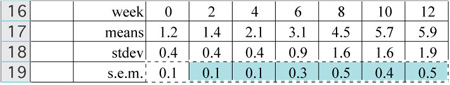
You should have 0.9 in for the standard deviation and 0.3 in for the standard error of the mean.
Here are the summary statistics for your data.
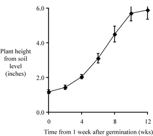
You have plotted mean values versus week of measurement, and now you need to add error bars representing the s.e.m. for each mean value. Click once on a data point to select the series. "Series" is what they call a single set of plotted data. Go to the menu item Format/Selected Data Series... A box comes up offering a variety of selections including Colors and Lines, Axis, etc. One choice is "Y Error Bars." That is the selection that you want.
Now the new box gives you a number of choices, some of which do not make sense to anyone who works in science. Excel was designed primarily for business applications, so perhaps there is a good reason for using a fixed value, percentage, etc. to prepare error bars for a graph. What you want, though, is Custom error bars, and you want to display both up and down errors. Select the icon for "Both" and select "Custom."
With the cursor in the "+" window select the cells with the s.e.m. data, as in the figure. Move to the "-" window to do the same, then click OK. Error bars should now come up in your figure. The default may call for error bars that are too faint. It seems as if we have to improve on all of the defaults, doesn't it? Select a single error bar and under Format you can proceed to change the weight of the lines in your error bars. I would use a weight of 2 or 3 point.
 |
 |
There's always something, of course. now the last two error bars are cut off. Double clicking the y axis and changing the maximum value of the scale to 7 takes care of that little issue.
Now it's time for you to get in a little practice. Here is a set of data for Morus alba, the common species of mulberry in the eastern U.S. Again, we have inches of height versus time in weeks. Calculate the mean values, standard deviations, s.e.m. values, and create a plot just as we created for Acer palmatum. Now, if you wanted to compare the growth rates of these two species would you simply print the two plots side by side?
Yes No
| week | 0 | 2 | 4 | 6 | 8 | 10 | 12 |
| measured | 1.5 | 2.1 | 2.8 | 3.7 | 6.8 | 7.3 | 7.5 |
| heights | 1.2 | 1.5 | 5.6 | 4.9 | 9.7 | 10.5 | 9.5 |
| in inches | 1.4 | 2.4 | 2.5 | 7.9 | 9.6 | 8.6 | 9.6 |
| 0.3 | 3.2 | 1.2 | 7.4 | 7.7 | 9.4 | 12.1 | |
| 0.5 | 2.0 | 3.0 | 5.1 | 6.0 | 9.2 | 7.3 | |
| 1.6 | 2.8 | 0.6 | 5.6 | 5.2 | 11.1 | 10.1 | |
| 1.3 | 2.8 | 4.1 | 5.1 | 9.0 | 8.8 | 12.0 | |
| 0.2 | 0.3 | 4.1 | 5.1 | 6.7 | 4.0 | 14.0 | |
| 0.0 | 0.7 | 2.8 | 5.3 | 10.5 | 11.1 | 11.1 | |
| 1.2 | 2.5 | 4.5 | 6.5 | 7.7 | 10.9 | 10.0 | |
| 0.5 | 4.0 | 3.1 | 5.1 | 6.5 | 10.6 | 13.3 | |
| 0.6 | 2.9 | 3.4 | 5.9 | 6.4 | 9.9 | 7.8 |
Time is the independent variable, to be plotted on the x axis; height (a measured quantity) is a dependent variable, to be plotted on the y axis.
A good choice for plotting these data is to use a scatter plot (XY scatter) of mean values verus time, rather than a scatter plot of raw data; other plot types are not suitable for this kind of data set.
"Computer clutter" should be replaced by X and Y axis labels, a figure caption, and perhaps an appropriate trend line.
A good caption includes just enough information to permit it to stand apart from text.
We typially include an error estimate when reporting mean values
– standard deviations for means reported in text or a table and
error bars representing the s.e.m.s for mean valuess in a scatter
plot.