Before
You will need a figure caption, of course.
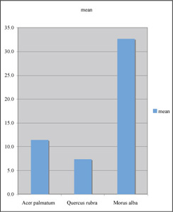
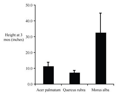
Here is a modified graph. Notice that most of the modifications are those that we used for the previous scatter plot. Once again, we have done nothing fancy. We are just reporting the findings, clearly, with no clutter. This time it doesn't matter if the axes are proportional, because the x axis is non-parametric. Length of the x axis is just enough to make the categories readable.
Before |
After | |
|---|---|---|
|
|
If we added more species we might use two lines for the category (species) names.
| _____________________________________ | |||
Acer palmatum |
Quercus rubra |
Morus alba |
Next species |
Complete the caption and you have a finished figure.
Time is the independent variable, to be plotted on the x axis; height (a measured quantity) is a dependent variable, to be plotted on the y axis.
A good choice for plotting replicate data is to use a scatter plot (XY scatter) of mean values verus time, rather than a scatter plot of raw data; other plot types are not suitable for plotting two continuous parametric variables.
"Computer clutter" should be replaced by X and Y axis labels, a figure caption, and perhaps an appropriate trend line.
A good caption includes just enough information to permit it to stand apart from text.
We typially include an error estimate when reporting mean values
– standard deviations for means reported in text or a table and
error bars representing the s.e.m.s for mean valuess in a scatter
plot.
If you intend to compare two sets of data they should be plotted on axes with the same scale and proportion; if practical they should be plotted in the same figure.
When data are suitable for presentation in a figure, a figure is often preferable to a table or text.
When the independent variable is categorical, a column graph is usually the best choice.