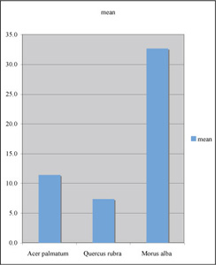
Here are the summary data in rows. You could just as well have put them into columns. Notice the use of standard deviation rather than standard error of the mean. Although the data will be presented visually, we are interested in individual variability among individuals.
| Species | mean | stdev |
| Acer palmatum | 11.4 | 2.34 |
| Quercus rubra | 7.4 | 1.25 |
| Morus alba | 32.7 | 13.8 |
Here is what an initial column graph looked like, before making modifications. This time I highlighted the headings "species""mean" before choosing the Chart Wizard (omitting the s.e.m. for now).
Now let's clean up the "computer clutter," put in appropriate labeling and error bars, and make any other changes that you believe are necessary. Now, to make this graph a figure, what else should be do?
Time is the independent variable, to be plotted on the x axis; height (a measured quantity) is a dependent variable, to be plotted on the y axis.
A good choice for plotting these data is to use a scatter plot (XY scatter) of mean values verus time, rather than a scatter plot of raw data; other plot types are not suitable for this kind of data set.
"Computer clutter" should be replaced by X and Y axis labels, a figure caption, and perhaps an appropriate trend line.
A good caption includes just enough information to permit it to stand apart from text.
We typially include an error estimate when reporting mean values
– standard deviations for means reported in text or a table and
error bars representing the s.e.m.s for mean valuess in a scatter
plot.
If you intend to compare two sets of data they should be plotted on axes with the same scale and proportion; if practical they should be plotted in the same figure.
When data are suitable for presentation in a figure, a figure is often preferable to a table or text.