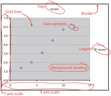
In this form your graph is fine for a quick data check, but it is far from suitable for publication. You will want to delete the "computer clutter" and add labels and other important information to transform your graph into an informative figure that could stand apart from text.
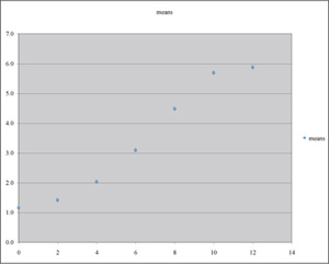
At left is the plot exactly as it first appeared. Your plot may be different depending on how you sized your window and/or your program defaults. The major features are enlarged and identified in the right figure.
|
|
Now we need to make some modifications to turn this crude graph into an effective figure. First, which of the labeled features will you eliminate? We will keep the axes themselves, of course.
Title
Grid lines
Border
Data symbols
Legend
Background shading
X axis scale
Y axis scale
Time is the independent variable, to be plotted on the x axis; height (a measured quantity) is a dependent variable, to be plotted on the y axis.
A good choice for plotting these data is to use a scatter plot (XY scatter) of mean values verus time, rather than a scatter plot of raw data; other plot types are not suitable for this kind of data set.