It will be simpler to describe what to keep. Keep the axes and scales, including the tic marks and numbers, and keep the data symbols. All of the rest should go. Much of it is what we call "computer clutter." Computer clutter consists of unnecessary features that are put into a computer generated graph by default.
To put it simply, this will be your figure, designed by you. You don't let people you have never met write your papers for you, right? At least we hope not! Similarly, you must not allow the well-meaning but perhaps misguided intentions of a software designer determine the appearance of the elements that you use to communicate your findings.
To make the recommended changes you can click or double click on some of the unwanted items and use the delete key. You may need to use the menu to remove or modify some items. Under the menu item Chart is the choice Chart Options... With the graph selected, you can use Chart Options... to remove the legend, title, and grid lines. If you double click on the background you can remove the "fill," that is, the background shading. Format/Selected Chart Area... also lets you remove the fill and also the border around the entire figure.
When you want to change text orientation, a data symbol, legend, etc. you can obtain options by selecting the item then going to Format in the upper menu. You will see a choice, Format [selected item].. You may want to experiment with the available features. Most of us learn to use these programs by simply trying things out.
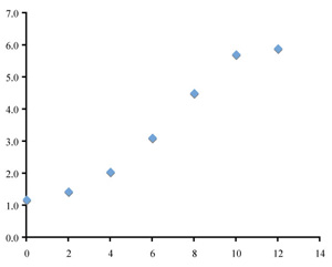
The left image below shows what the graph should look like after removing unwanted features. The data symbols, axes, and axis lines have been enlarged for clarity.
|
|
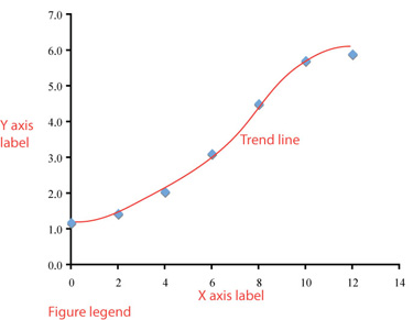
Now we need to make some modifications to turn this crude graph into an effective figure. In the right image (above) possible additions and their appropriate locations are labeled. Which will you include in your figure?
Trend line
Y axis label
X axis label
Figure legend (caption)
Time is the independent variable, to be plotted on the x axis; height (a measured quantity) is a dependent variable, to be plotted on the y axis.
A good choice for plotting these data is to use a scatter plot (XY scatter) of mean values verus time, rather than a scatter plot of raw data; other plot types are not suitable for this kind of data set.
We usually must remove some "computer clutter" from a computer-generated graph.