All of the responses summarize the central tendency of a data set, however the mean (average value) is most commonly used for continuous parametric data. High/low values might be useful if you want to indicate volatility, as with the stock market. However, in awhile we will introduce a preferable measure of "volatility," better known in science as a standard error. The median is the middle number in a list of raw data. The median might represent the average value fairly well if the data are normally distributed, but it is more analytical to use the mean. The mode is the number that is repeated most often. The mode may or not reflect the central tendency accurately.
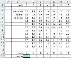
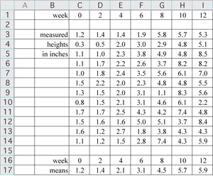
Thank goodness for spreadsheets. To follow along in Excel you might copy the data and paste into a new worksheet with cell B1 selected. To eventually plot the data we want the plotted variables to be adjacent, either in columns or in rows as we have it here. Copy row 1 headed by "week," and paste it into row 16.
In this example, to compute the mean for each of the seven data sets label the next row in your spreadsheet as "means." To keep it simple, format the cells to display 1 decimal place as shown (Format/Cells.../Number). The program retains full precision regardless of what you display. Next, type the formula =average( ) into the highlighted cell, place the cursor between the parentheses, and select the data in column C. The relative formula will read "=average(C3:C14)." Hit ENTER or RETURN and you should see a value of 1.2 in cell C16 (1.183333333, with full precision). Copy the formula (copy cell C16) and paste it into the remaining cells in row 16, or select cells C16:I16 and fill right (control-R).
|
|
If we had the data in columns instead of rows we would want the column containing the independent variable to be in the left column. Which variable, time or height, should be in the right column?
time
height
Time is the independent variable, to be plotted on the x axis; height (a measured quantity) is a dependent variable, to be plotted on the y axis.
The logical choice for plotting continuous parametric variables is a scatter plot (XY scatter), not a line, column, or other type graph.
A scatter plot of raw data is useful when one is interested in correlations between variables.
The other common plot type, used when the independent variable is a categorical variable, is a column graph; other plot types are seldom used in science.