Does caption A tell us anything that isn't obvious from looking at the graph itself? Could the figure stand apart from text with caption A? All we know without reading the paper itself is that someone measured plant height while it was growing.
Caption B describes the purpose of the figure and adds two important facts, namely what species was studied and that these were new seedlings. This caption would work, but compare with caption C.
Caption C includes the information in B but also explains the variables a bit more clearly. Growth of twelve seedlings was followed and mean values are plotted. The starting point for measuring growth is described as is what the author meant by plant height.
Caption D is the most informative of all, but does a reader need all of this information? Is it necessary to know that the experiment began on July 2 or that the author purchased a ruler from Office Depot?
The criteria for writing an effective caption may not be obvious at first. It takes practice to produce effective papers which is why we have you write them for classes.
|
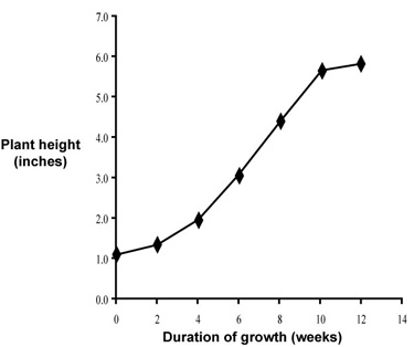
| Fig. 1. Mean growth rate for ten Acer palmatum seedlings. Measurements began one week following germination. Height was measured as the distance from soil level to base of the top leaf of the seedling. |
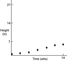
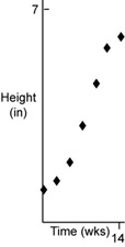
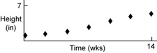
This is much better. Now for a little more cosmetic work and we'll move ahead. Notice one thing for now, though. The plot area is proportioned so that the data fill most of it. It is also proportioned so that both variables are equally represented. That is, the plot area is square. Compare with some examples of badly-proportioned graphs.
 |
 |
 |
Think of a few changes you might make to figure 1, just to neaten it up. We will then move on.
Time is the independent variable, to be plotted on the x axis; height (a measured quantity) is a dependent variable, to be plotted on the y axis.
A good choice for plotting these data is to use a scatter plot (XY scatter) of mean values verus time, rather than a scatter plot of raw data; other plot types are not suitable for this kind of data set.
"Computer clutter" should be replaced by X and Y axis labels, a figure caption, and perhaps an appropriate trend line.