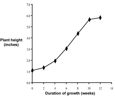
labeled, data interpolated
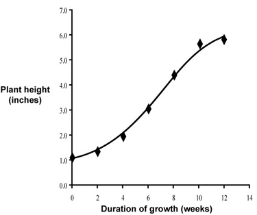
labeled, smooth trend line
Each axis should be labeled with the name of the variable and the unit used. This is so universal a rule, it is difficult to come up with exceptions. Other information, such as species studied, belongs in the caption. Some information need not be presented in the figure at all. For example, it is seldom relevant when an experiment was conducted. Ranges of variables will be indicated by the axis scales themselves.
Line fit, polynomial curve fit, and exponential fit are examples of mathematical curve fits. Curve fits are appropriate when a mathematical model can be applied to a relationship, especially when there is a theoretical basis. For example, provided the data agree we can use a line fit when plotting optical density versus concentration, because proportionality is predicted by Beer's Law. We can use an exponential fit when plotting population versus time provided that population growth is in an exponential phase.
Many relationships in biology are complicated by multiple factors, producing phases in a relationship that are not readily predicted mathematically. Even in the examples above, a curve fit only works for the early part of the relationship. Above some concentration limit optical density may no longer change with concentration. As population increases exponential growth typically gives way to a stationary phase and eventually a death phase, due to competition for nutrients and oxygen, buildup of waste products, and perhaps other factors.
It looks like a polynomial curve fit might work for your data, but you have no mathematical or physical model to back up the assumptions you would need to make. The data are very consistent, though, suggesting that you might merely interpolate the data. With interpolation we simply connect the data points with straight lines.
The data were subject to experimental error, so the sample means that you recorded might be "off" a bit. You might best display the trends using a smooth drawn line that follows the data but does not necessarily intersect each and every point. For these data it appears that either method, interpolation or a drawn trend line, will work fine. Let's go with interpolation for now.
labeled, data interpolated
|
labeled, smooth trend line
|
Notice that each trend line stops at 12 weeks, which was the time the final measurement was taken. The trees might have grown more, but we do not have data to support that conclusion.
Choosing a trend line may seem like a difficult decision to make, in part because there are no hard and fast rules. Different supervisors, manuscript editors, and even entire scientific disciplines may prefer one style over another. The best advice for now is to put in lots of practice. Application of a skill often becomes second nature when you apply it frequently.
The term legend can apply to the numbered caption beneath a figure and also to a part of the figure itself that explains data symbols and/or trend lines. To prevent confusion, from now on we will refer to the information beneath the figure as a caption. Captions are numbered consecutively and in the final copy each is placed beneath its corresponding figure, or less frequently to one side of the figure, depending on editorial needs.
A good caption provides sufficient information so that a reader can look at the figure and know what it is intended to represent. That is, an informative caption allows a figure to stand apart from text. Here are several captions that a student might submit with this figure. Choose the one that you think best serves the purpose of a figure caption.
A
Fig. 1. Plant height versus duration of growth.
B
Fig. 1. Growth rate of Acer palmatum seedlings following germination.
C
Fig. 1. Mean growth rate for twelve Acer palmatum seedlings. Measurements began one week following germination. Height was measured as the distance from soil level to base of the top leaf of the seedling.
D
Fig. 1.Mean growth rate for twelve Acer palmatum seedlings. Measurements began on July 2, 2008, one week following germination. Height was measured as the distance from soil level to base of the top leaf of the seedling, using a 1 foot plastic ruler from Office Depot.
Time is the independent variable, to be plotted on the x axis; height (a measured quantity) is a dependent variable, to be plotted on the y axis.
A good choice for plotting these data is to use a scatter plot (XY scatter) of mean values verus time, rather than a scatter plot of raw data; other plot types are not suitable for this kind of data set.
We usually must remove some "computer clutter" from a computer-generated graph.
A complete figure should include X and Y axis labels, a figure caption, and perhaps a trend line.